
Provincial Airways - Detailed Study of 3d air label.
Copyright
© 2022 Robert Farquharson All Rights Reserved
-
British Internal Airmails of the 1930’s
This long article by an unknown author is the write-up of an ‘old time’ collection of the material associated with the
production of the Provincial Airways 3d Air label. It was probably collected at about the time of the production of the label. It
fails to mention the final 5th printing of the label that was done after flying mail was barred by the Postmaster General and
instead says there was a supplementary to the second printing. In order to keep in line with current use, we can presume that
second supplementary was third, third was fourth and fourth was fifth. Whilst the author is unknown and the contents
unverified the contents appear sound and it is a fascinating in depth study of the production of the air label. Because of its
size the article has been split into several sections. Whilst it does to some extent duplicate the material in the main section of
Provincial Airways, it is better presented intact.
The Design
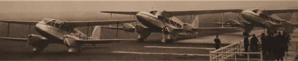
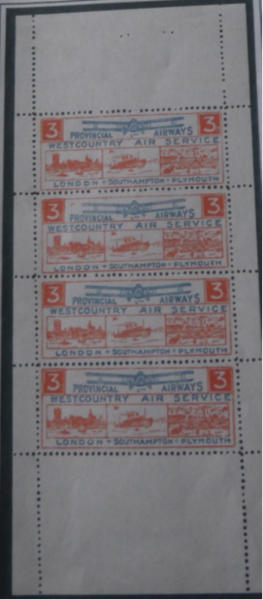
The design finally agreed upon was oblong in shape, 6Omm. by 22mm. the value 3d being in white figures on a coloured background in the two upper corners with three small oblong views underneath of the Houses of Parliament, an Atlantic Liner and Plymouth Hoe. This comprised the main duty plate and was printed in orange as on the issued stamp. The design was completed by printing from another block in blue. with a biplane in flight. The name Provincial Airways Ltd., and West Country Air Service in the upper panel and in the lower one, LONDON-SOUTHAMPTON-PLYMOUTH. Owing to the small size of the three views, the detail in these is rather indistinct, particularly in the view of Plymouth Hoe, which is shown from the sea. It is known locally as the ‘Tinside stamp’, as this is the name given to the particular portion of the seafront, which includes the Corporation Bathing Pool.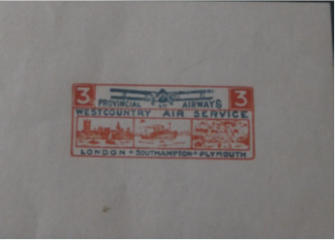
This is the final pull and was printed on ungummed art paper. The design was accepted by Provincial Airways in the finished colours of Orange and Blue
on white paper.
The Issued Stamps
They were printed in panes of four with margins perforated all round and bound into booklets of five sheets. The first printing had very much larger margins top and bottom than the subsequent issues. The stamps are 3.5mm apart.The First Printing
The Stamp Differences
A. The first stamp has a broken frame line above the left hand 3d box. B. The second stamp has an orange mark above “Provincial”. This does not appear on subsequent printings. C. The third stamp has a wavy edge to the right hand 3d box. D. The fourth stamp has a diagonal white line beside the 3d in the left hand box. E. The “O” in SOUTHAMPTON has a break on the right side and looks like a “C”. It is most noticeable on stamp B and C. The first issued was thought not to have been stapled but the sheet disproves that although panes have been seen without staple holes in the top margin. The first issue was released on 20th October 1933 and amounted to 2500 stamps.The Second Printing
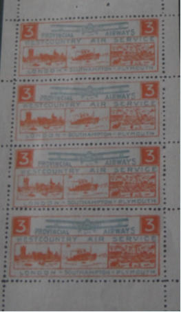
The second printing and the subsequent issues had narrower top and bottom margins and the
stamps are 4mm apart
The Sheet Differences
The stereotypes were broken down after the first printing and reassembled in a different order.
1st Printing
2nd and 3rd Printing
A
B
B
D
C
C
D
A
The 2nd printing had a narrower sheet width of 75mm and was a paler colour with good definition.
The second printing was made early in November 1933 and consisted of 2,500 stamps.
The Second Supplementary Printing.
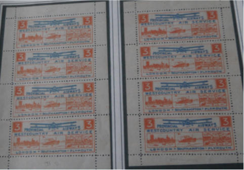
The second printing was done in two sessions. The first
batch was a lighter shade, the second being darker and
more intense. This is referred to as the supplementary
printing. All sheet sizes for the different printings were
consistent except for the later 2nd print run. The sheets
range from 78mm to 80mm across and 123mm to
128mm high which is evident in the two sheets shown
below.
The Third Printing.

This printing is in a much deeper shade of blue and orange than the previous ones.
The impression is very blurred and heavy. Because of the heavy inking the “d” of “3d” is almost or
entirely missing.
As with the second printing, the second stamp shows the broken “O” in SOUTHAMPTON which makes
it look like SCUTHAMPTON. Also some of the “O’s” in LONDON shows breaks and are particularly
noticeable in the third stamp down
The sheet width is a constant 81mm.
The Fourth Printing.

The fourth and last printing can be easily distinguished from the others as the orange is a very
much deeper orange-red.
The Stereotype was again rearranged so that the image with the missing funnel was omitted.
This was done by moving the second image to the fourth position which is evident by the
damaged “P in “PROVINCIAL”. A new image was inserted into the second position.
There are pronounced flaws on the plate which do not appear on the other printings noticeably
white flecks in the right hand value tablet of the three stamps.
The fourth printing was the balance of the order placed with the printers, Messrs Clark Doble
before the postmaster-General banned the service. The fourth printing consisted of 2500
stamps. The total for the four printings was 12,3000 stamps.


Provincial Airways - Detailed Study of 3d air label.
Copyright
© 2020 Robert Farquharson All Rights Reserved
British Internal Airmails of the 1930’s
This long article by an unknown author is the write-up of an ‘old time’ collection of the material associated with the
production of the Provincial Airways 3d Air label. It was probably collected at about the time of the production of the label. It
fails to mention the final 5th printing of the label that was done after flying mail was barred by the Postmaster General and
instead says there was a supplementary to the second printing. In order to keep in line with current use, we can presume that
second supplementary was third, third was fourth and fourth was fifth. Whilst the author is unknown and the contents
unverified the contents appear sound and it is a fascinating in depth study of the production of the air label. Because of its
size the article has been split into several sections. Whilst it does to some extent duplicate the material in the main section of
Provincial Airways, it is better presented intact.
The Design
The design finally agreed upon was oblong in shape, 6Omm. by 22mm. the value 3d being in white figures on a coloured background in the two upper corners with three small oblong views underneath of the Houses of Parliament, an Atlantic Liner and Plymouth Hoe. This comprised the main duty plate and was printed in orange as on the issued stamp. The design was completed by printing from another block in blue. with a biplane in flight. The name Provincial Airways Ltd., and West Country Air Service in the upper panel and in the lower one, LONDON-SOUTHAMPTON-PLYMOUTH. Owing to the small size of the three views, the detail in these is rather indistinct, particularly in the view of Plymouth Hoe, which is shown from the sea. It is known locally as the ‘Tinside stamp’, as this is the name given to the particular portion of the seafront, which includes the Corporation Bathing Pool.
This is the final pull and was printed on ungummed art paper. The design was accepted by Provincial Airways in the finished colours of Orange and Blue
on white paper.
The Issued Stamps
They were printed in panes of four with margins perforated all round and bound into booklets of five sheets. The first printing had very much larger margins top and bottom than the subsequent issues. The stamps are 3.5mm apart.The First Printing
The Stamp Differences
A. The first stamp has a broken frame line above the left hand 3d box. B. The second stamp has an orange mark above “Provincial”. This does not appear on subsequent printings. C. The third stamp has a wavy edge to the right hand 3d box. D. The fourth stamp has a diagonal white line beside the 3d in the left hand box. E. The “O” in SOUTHAMPTON has a break on the right side and looks like a “C”. It is most noticeable on stamp B and C. The first issued was thought not to have been stapled but the sheet disproves that although panes have been seen without staple holes in the top margin. The first issue was released on 20th October 1933 and amounted to 2500 stamps.The Second Printing
The second printing and the subsequent issues had narrower top and bottom margins and the
stamps are 4mm apart
The Sheet Differences
The stereotypes were broken down after the first printing and reassembled in a different order.
1st Printing
2nd and 3rd Printing
A
B
B
D
C
C
D
A
The 2nd printing had a narrower sheet width of 75mm and was a paler colour with good definition.
The second printing was made early in November 1933 and consisted of 2,500 stamps.
The Second Supplementary Printing.

The Third Printing.
This printing is in a much deeper shade of blue and orange than the previous ones.
The impression is very blurred and heavy. Because of the heavy inking the “d” of “3d” is almost or
entirely missing.
As with the second printing, the second stamp shows the broken “O” in SOUTHAMPTON which makes
it look like SCUTHAMPTON. Also some of the “O’s” in LONDON shows breaks and are particularly
noticeable in the third stamp down
The sheet width is a constant 81mm.
The Fourth Printing.
The fourth and last printing can be easily distinguished from the others as the orange is a very
much deeper orange-red.
The Stereotype was again rearranged so that the image with the missing funnel was omitted.
This was done by moving the second image to the fourth position which is evident by the
damaged “P in “PROVINCIAL”. A new image was inserted into the second position.
There are pronounced flaws on the plate which do not appear on the other printings noticeably
white flecks in the right hand value tablet of the three stamps.
The fourth printing was the balance of the order placed with the printers, Messrs Clark Doble
before the postmaster-General banned the service. The fourth printing consisted of 2500
stamps. The total for the four printings was 12,3000 stamps.